THE GRADIENT BALL TRICK
|
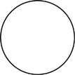
Choose the ellipse tool and create a circle. If you wish, you can double click on the tool and specify equal height and width dimensions in the resulting dialog box to ensure a circle. Then make sure that your circle has fill, but no stroke. A line around the outside would kill the illusion.
|
|
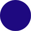
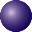
| Now fill the circle with a flat color. Chose one from your monochrome pallet, the color bar, or some other source. |
|
|
Next
you will create a gradient based on that color. If the gradient pallet
is not visible, pull down the “Window” menu and chose “Show
Gradient.” With your circle selected, drag the fill color from the
color pallet to the bar in the gradient pallet and release. This will
produce a gradient with black at one end, white at the other, and your
color in the middle. Now just click on the bar again, a little to the
right (or left) of your color. This will produce a second slider in your
color. Then drag the black and white sliders of the pallet, and move
your colored sliders to each end. (If the gradient bar had other colors
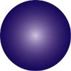
in it, just drag those off in the same manner.) At this point you will have a ball that is filled with a gradient that is composed of identical colors, so it will appear to be flat. |
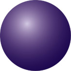
| In the gradient pallet, click on the slider on the left. Its attributes will appear in the CMYK sliders in the color pallet. Now hold down the shift key and move any one of the color sliders to the left until the color becomes a very light tint, approaching white. (Like I taught you to do in making tints for your monochrome pallet.) Then click on the right gradient slider and add a little black to it by moving only the K color slider. (Like I taught you to do in making shades for your monochrome pallet.) Next, in the gradient pallet, move the color midpoint (the little diamond on top of the bar) over a little closer to the light end (the left), and set the gradient “type” for "radial." |
|
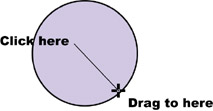
| Now you are ready for the fun part. With your circle still selected, chose the gradient tool from the tool bar. You use the gradient tool by clicking at a point where you want the color on the left side of the gradient bar to start, and dragging to a point where you want the color on the right side of the gradient bar to end. In this case you are going to start from the place you want the ball’s highlight to be, and end where you want the darkest shadow. |
|
| You can do this over and over to change the highlight location to match the light direction in your picture. |
|
SHADOWS IN ILLUSTRATOR
| EASIEST: No shadows, just match the dark end of the gradient with the surface color. | 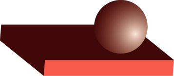 |
| In the first example, we set the color at the dark end of the gradient bar used in the ball to match the color of the surface the ball sits on. This means that the dark side of the ball will appear to have no edge where the two identical colors butt up against each other. This will fool the eye into perceiving depth because the highlighted part of the ball will pop forward and the dark side will appear to disappear into the distance. |
| SIMPLE
GRADIENT
Purple to Cyan |
 |
| The second example uses an ellipse shape, filled with a gradient, as the shadow. If the surface the ball is sitting on is a solid color, this approach will work fine. The shape and direction of the ellipse must match the perspective of the surface plane. With this accomplished fill the ellipse with a simple gradient that uses the dark color in the ball’s gradient for one color slider, and the color of the surface for the other. Adjust the sliders so that the dark area surrounds the base of the ball and then fades convincingly into the color of the surface and disappears at the edges. |
|
|
PURPLE GRADIENT @ 69% TRANSPARENCY
| The third example uses Illustrator 9’s transparency function to shade a complex surface. This works if you want to convey a shadow on a somewhat reflective plane. The shadow is an ellipse filled with a gradient (like the last one), but the light color is white (because that is the lightest color of the many that the shadow will have to cross). With the filled ellipse selected, switch to the transparency pallet and adjust the opacity to a level that is effective in your picture. This will make some of the areas near the shadow’s edge grayer (and lighter) than the surface outside the shadow. |
| PATHFINDER
Soft Mix |
 |
|
The last example uses the soft mix filter in the pathfinder pallet. Like the other pathfinder filters, it will create a new set of filled shapes based on the overlapping objects you select. In this case, an ellipse is created with a “V” section removed to match the surface it will cover. This is filled with a solid color close to the one used as the dark side of the gradient ball. Then you select the ellipse and all of the filled shapes it will cross. Finally, in the pathfinder pallet, click “soft mix.” It’s the middle button in the third row. (If you only see two rows of buttons, hit the pallet’s menu button and pick “show options.”) The filter will show you a dialog box where you can specify the percentage of the ellipse color you want mixed with the underlying colors (experiment with this). Once you supply a number and click “OK,” the filter will create new filled shapes containing colors that are “mixed” between the ellipse color and the color beneath. The combination of these forms, in the shape of the ellipse, provides the illusion of a see-through shadow. In Illustrator 10, "soft mix" was moved to the Effects pull down menu. In it's new form, it no longer creates separate filled shapes, and the objects affected must be grouped.
|