Design 10C
The assignment:
Produce an 11 step monochromatic palette progressing from
the lightest tint to the darkest shade, and use it to design a page featuring a
monochromatic color scheme. In this first monochromatic assignment, the
predominant graphic image must be a letter or number form. The letter can be
from any language and may be repeated.
Information:
What’s a
monochromatic palette?
A color scheme that includes only tints and shades of a single color.
What’s a tint?
A tint is the lightening of a color by the addition of white. On a computer screen, the white comes from the background “white” color of the screen. We will tint colors by decreasing all of the other components of the color in relation to the white screen.
What’s a shade?
A shade is the darkening of a color by the addition of black. On a computer screen, we shade a color by moving the black slider in the CMYK display.
How do I make this 11
step palette?
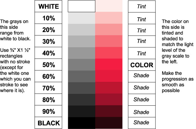
We will do it in two steps. First you will create an 11 step gray palette, and then you will choose a color and use it to produce a matching monochrome palette. Make the tints and shades in the monochrome palette match the light levels in the gray palette. The result will look like this:
You use the CMYK (Cyan, Magenta, Yellow, Black) sliders in
the Color
Pallet to create the colors. In the gray scale, all the colors will be
set to zero. Select the rectangle you wish to work with and type in the
corresponding percentage of black from the chart above and hit enter.
You can get an even progression in this manner without using any visual skills.
To create the color side, start by reproducing just one of
the rectangles and filling it with the color of your choice. (Start with a color
that that contains no black or white. If you pick a sample in the rainbow Color
Bar, pick one from the center of the bar (the equator). The ones at the
top and bottom have already been tinted or shaded. Now move this first colored
rectangle up and down next to the gray scale until you find the place where the
light value of the color matches the light value of gray scale. This will be
your middle value. You will create “tints” of this color above this level
and “shades” of this color below.
Let’s do the tints first. Make a copy of the middle value
rectangle you just worked with and place it in the open space above the middle
value rectangle. With this new rectangle selected, hold down the SHIFT
key and use the mouse to slide any of the color selectors a little to the left.
Notice how all of the color sliders moved with the one you moved. This
maintained the color proportion in the tint, and it happened because you held
down the shift key. If you
hadn’t, only one of the color sliders would have moved and the color would
have changed. Try to match the light value in your new tint to the light value
of the gray rectangle to the left of it. Now make a copy of your new tint, place
it in the next space up, and tint it to match the gray scale. Keep this up until
you reach the top slot.
To make the shades, you make a copy of your middle value
rectangle and move it down to the first open spot below your middle value
rectangle. Leave the color sliders alone and move the black slider a little to
the right. This will darken the color without changing its hue. Try to match the
light value in your new shade to the light value of the gray rectangle to the
left of it. Use this copying and darkening process repeatedly until you reach
the bottom slot.
How do I use this in
producing my design?
Select the whole thing and move it to a place on your screen that is outside the print area. As you create the shapes and lines that make up your monochromatic design, you can use the eyedropper tool to pick colors from the palette you just produced.
The following information is excerpted from the Name & 3 Lines project many of you may be familiar with from Design 1 or 2. I have included it here to help those that have never used the Type Tool get started. You won’t need to type your name, but you will use the same tools in creating your letter.
How do I
write my
name in there?
Pull down the type menu from the top of the screen and choose font. Pick anything from the resulting menu to get started.
Pull down the type menu again and choose size. Pick one of the larger preset sizes to get started.
Choose the type tool (the “T”)
Click anywhere on the work surface. You will see an insert cursor where you clicked.
Type your name.
Now click the selection tool to see your name as the selected object.
How do I change the
typeface? How do I change the size?
Make sure your name is selected (you will see the base line and a small square at one end).
Pull down the type menu and choose font. Then pick a new one from the resulting menus.
You change the size by pulling down the same type menu and choosing size. You can use one of the preset point sizes, or click on other to bring up a dialog box in which you type in the size you want.
(See your instructor for more advanced and exotic type changing tools once you have mastered the basics).
How do I move things
around?
Choose the selection tool.
Click on the object you want to move. This selects the object. You will see its centerlines and anchor points.
Now put the arrow on top of the selected object. Push down the left mouse button and hold it down while you drag the object to a new location. Then let up on the mouse button.
You can also move selected objects small distances with the arrow keys on the keyboard.
How do I turn the
page on its side?
Pull down the file menu and choose Document Setup.
Click the Orientation button that pictures the way you want the page to look. (The tall way is called portrait and the flat way is called landscape.)
Now click the Print Setup button and choose the orientation you selected from the resulting dialog box and then click OK.
Click OK again in Document Setup and you will see the new orientation on the screen.
How do I save what
I’ve done?
Place your Zip disk in the external Zip drive.
Pull down the file menu and choose save.
The first time you do this, the program will ask you what you want to call the saved file. The name highlighted in blue is the “default” name. Just start typing your name and the default name will disappear and be replaced by yours.
In our class, you also need to tell the program to save your file to the drive that contains your Zip disk. I will show you how to do this on our classroom computers. (If you have a computer at home, you will probably save files to the hard drive because it’s faster.)
When you have given the file a name and told the computer where to put it, click save.
You don’t need this information to complete either of the monochrome projects. However, people with backgrounds in painting always ask about this after confronting the slider bars for the first time. So……, read on if you are interested.
Alas,....this only works in Illustrator 9 (or earlier versions), in Illustrator 10 the tool was changed.
How do I mix two
colors, or gray them using the compliment? I don’t see anything in the slider
bars that let me do this.
Illustrator doesn’t have a way to mix colors with the slider bars, but it does have a neat way to accomplish that using one of the pathfinder filters.
Create any shape and fill it with one of the colors you want to combine, then make a second shape and fill it with the other color. Arrange the shapes so that they overlap at some point, creating a shared area between them. Now do the following:
Illustrator will then mix the two colors in the area where the two shapes overlap. You can use the eyedropper tool to sample this color and use it anywhere else you like. You can play with the mix rate to get any proportion you want. This filter has lots of slick uses besides mixing colors. Ask me if you are interested. (see "Soft Mix" in the shadow tutorial)
In Illustrator 10, "soft mix" was moved to the Effects pull down menu. In it's new form, it no longer creates separate filled shapes, and the objects affected must be grouped. Since the resulting color is not contained in an independent shape, it can't be sampled with the eyedropper tool.